Santander | Paths to Prosperity
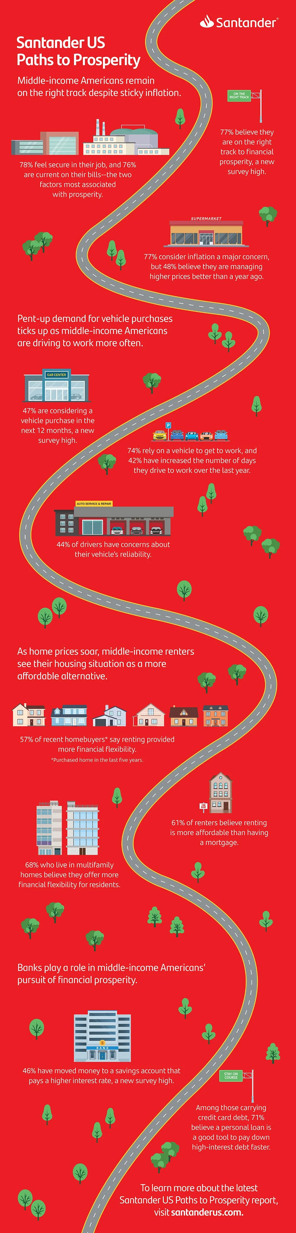
Santander US’s Paths to Prosperity research explores how middle-income Americans define success, build financial security, and navigate an evolving economic landscape. The challenge was to transform a broad set of research findings into a visual story that felt approachable, engaging, and easy to understand.
The centerpiece of the project was an infographic built around the metaphor of a winding road, representing the different paths people take toward financial prosperity. Research insights were woven throughout the journey, supported by custom illustrations, bold color blocks, and a clear information hierarchy designed to guide readers through complex data with ease.
To extend the reach of the research, a series of modular social assets was developed, each focused on a single insight or data point. Designed for flexibility across digital platforms, the system allowed Santander to communicate key findings consistently while maintaining a strong visual connection to the broader campaign.
As the initiative evolved, the visual language was refreshed to more fully embrace Santander’s brand, introducing greater use of the signature red palette alongside a more vibrant and contemporary design approach. The result is a scalable communications system that brings clarity, consistency, and impact to an ongoing research series.